The modern muse of vintage

This project aimed to rebrand Victoria’s Secret in a way that resonates with Gen Z by embracing nostalgia, inclusivity and imperfection. The rebrand aimed to address a gap in the lingerie indsutry of younger consumers with larger cup sizes. This would allow the brand to reconnect with audiences through values that resonate and create a visually refreshing rebrand.
The rebrand involved exploring Victoria’s Secret’s brand’s previous rebranding failures, industry gaps, and consumer needs. I Investigated Gen Z’s preferences for body inclusivity, authenticity, and vintage styles which led to the creative concept being rooted in nostalgia and individuality. I Combined digital design, photography, and bookbinding for a multidisciplinary visual output
I created a comprehensive rebrand Victoria’s Secret that included a visual campaign featuring diverse models with larger cup sizes, a lookbook designed to encourage physical interaction with the brand. I also produced mockups of posters, social media content. I created a trendy rebrand that would also encompase Gen Z’s values.
My project explores how fashion communication can be used to revive outdated brands and tap into consumer needs. I recognized the tension between nostalgia and modern values which my project carefully naviagates. However, I did consider that a digital lookbook would be more accessible and is something I should have further explored. During my initial research I also saw the interest that Gen Z has in sustainability and I feel it is something I could have easily incorperated.
PRoject research
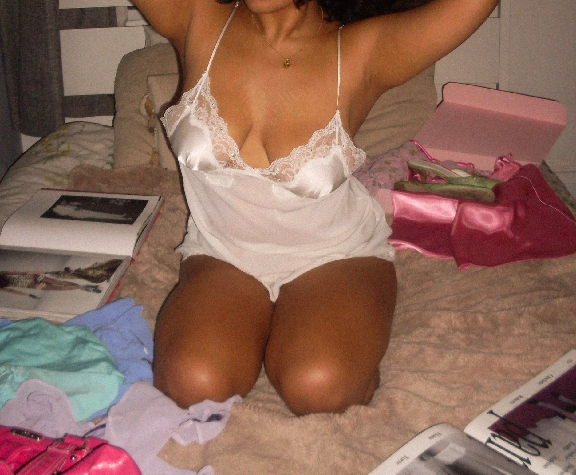
I began my research by exploring Victoria’s Secret’s brand evolution which involved comparing its original playful, hyper-sexualised identity with its attempt at rebranding which began in 2021. I created moodboards which allowed me to clearly see the contrast between older Victoria’s Secret campaigns with the recent rebrand of Victoria’s Secret. The stark contrast made the shift towards inclusivity feel inauthentic and a response to the backlash.
To further my research, I distributed surveys to lingerie industry professionals, which helped me to gain insights into gaps in the industry. I also researched Gen Z values, which led me to lean into nostalgia while also focusing on inclusivity, especially surrounding the gap I found in the market, which was the lack of larger cup sizes. This combination of primary and secondary research allowed me to build a campaign that was not only nostalgic but also aligned with consumers’ needs.
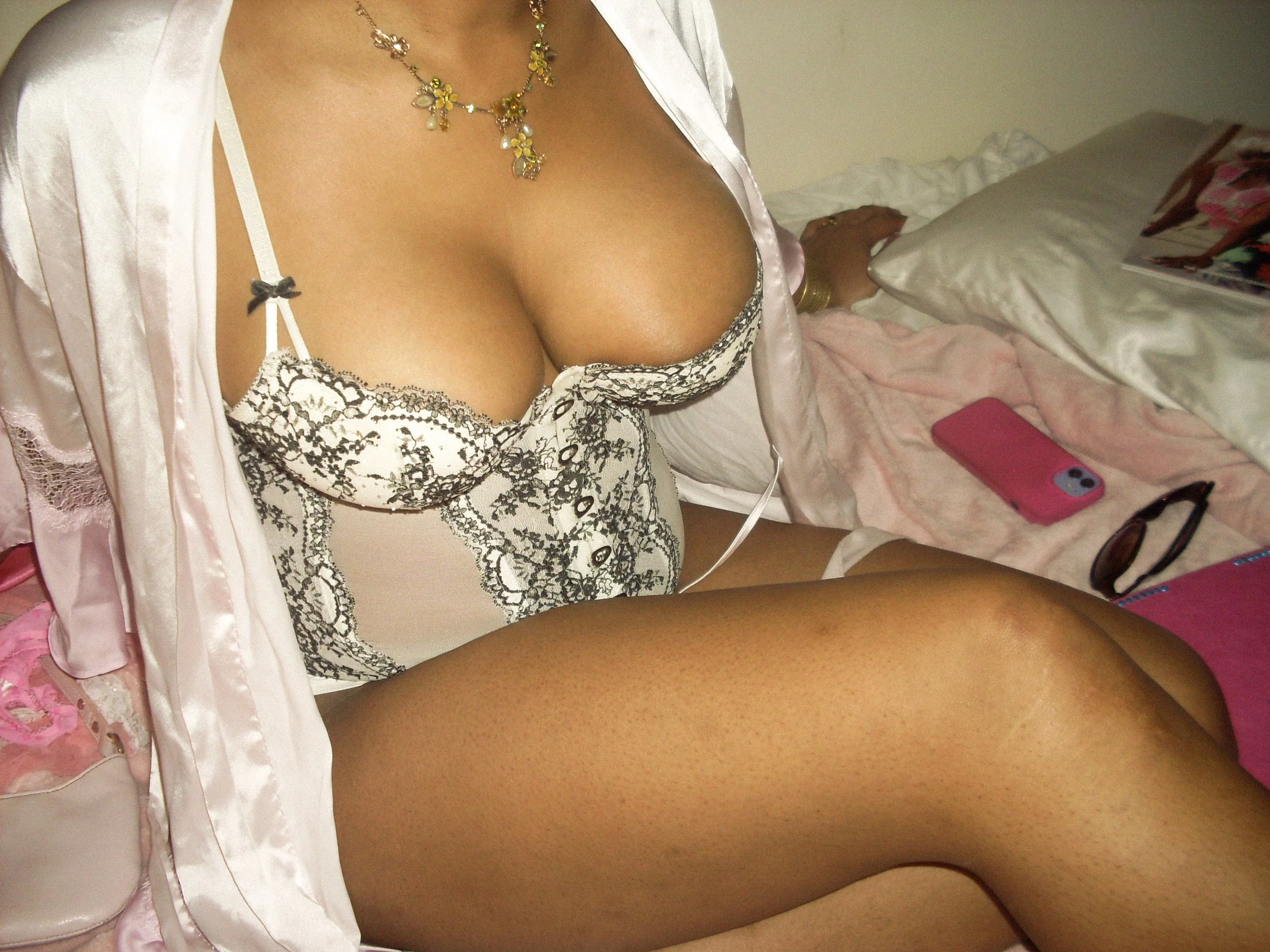
after the rebrand

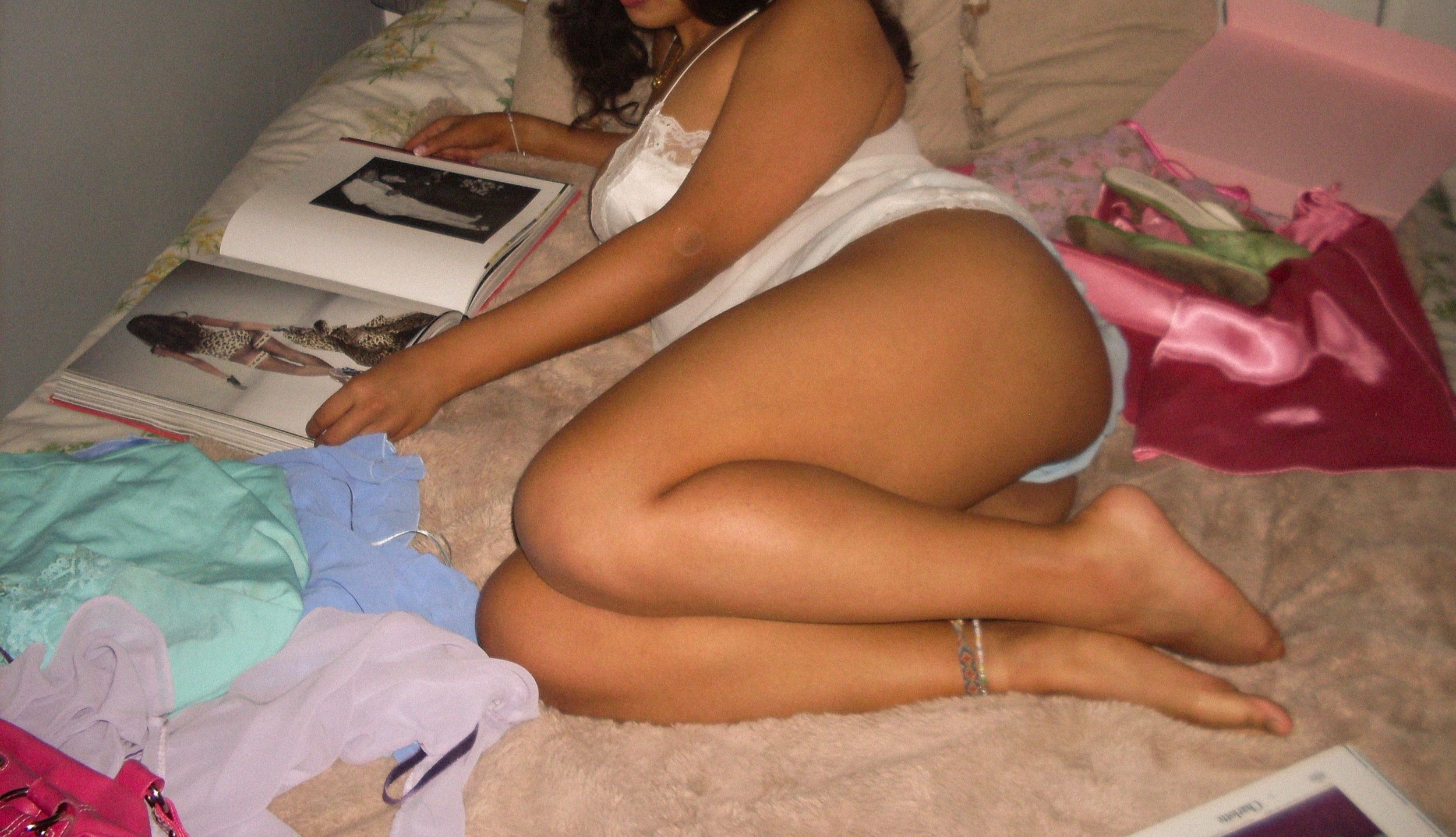
Before the rebrand

concept development
My project aimed to re-establish Victoria’s Secret in a way that reconnected with Gen Z through nostalgia and authentic inclusivity. I aimed to create a campaign that addressed a real gap in the lingerie market, which is stylish options for young people with larger cup sizes.
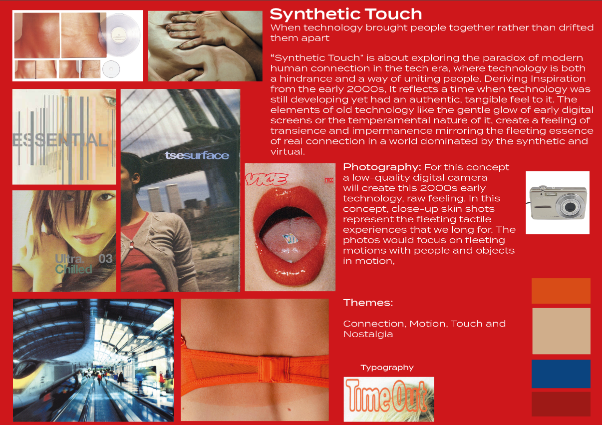
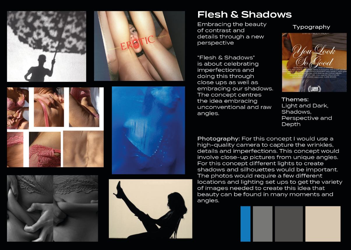
I initially developed “Synthetic Touch” and “Flesh & Shadows” as my concepts which then went on to be developed into my final concept of “Sheer & Shameless”. “Synethetic Touch” explores the nostalgia of early age technology and how it allowed for human connection rather than inhibited it. ‘Flesh & Shadows” delves into embracing imperfection as well as celebrating contrast in oneself as well as within lighting.
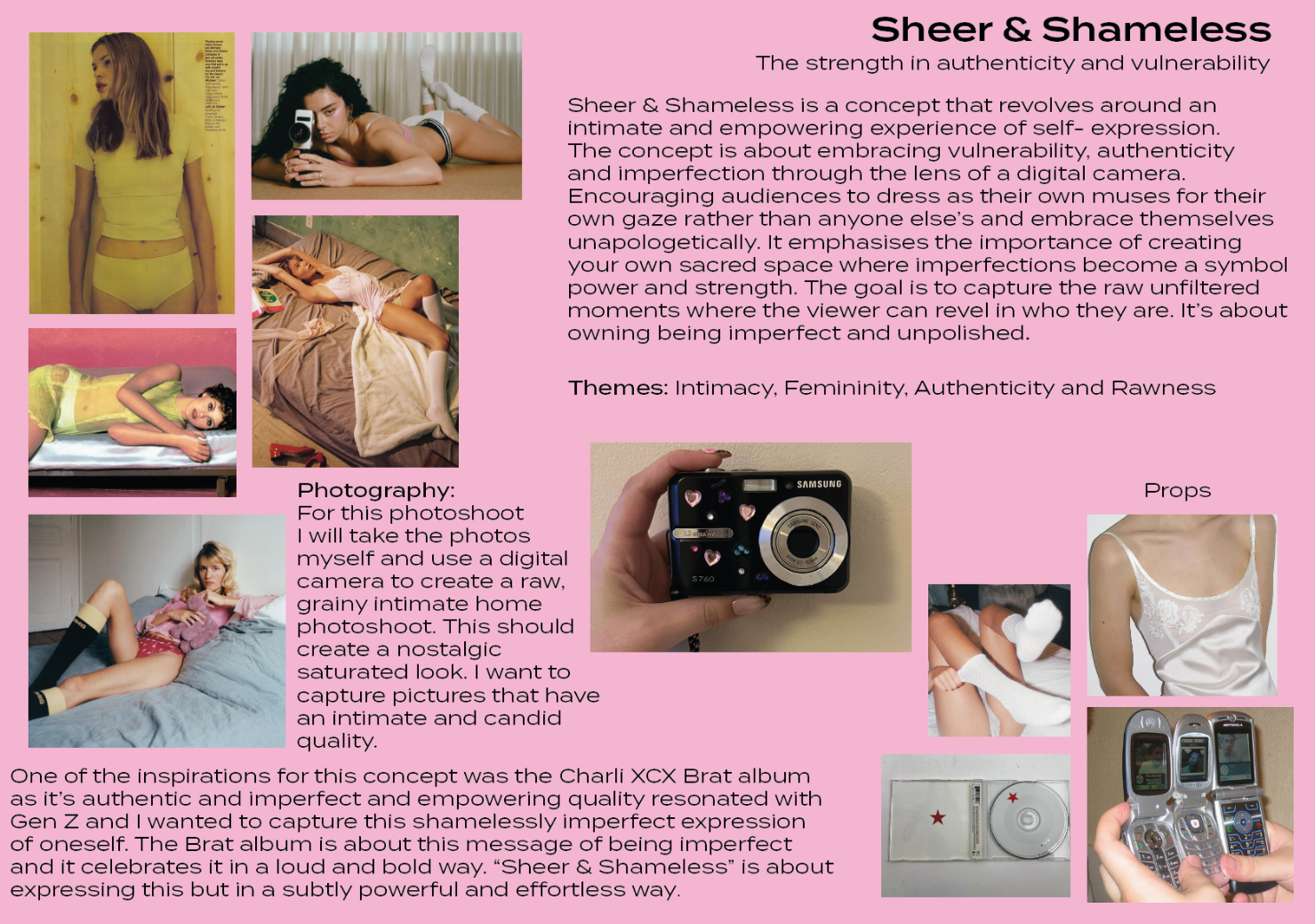
Aspects of each of these concepts lead to me developing my final concept “Sheer & Shameless”. This concept combines nostalgia with intimacy and imperfection which are aspects that were important from my previous concepts. This concept aligned with the brand identity of Victoria’s Secret more than the previous concepts and had a more light and playful feel while also tapping into deeper themes of vulnerability and authenticity which ultimately led to this being my final concept.
outcomes
The final outcome was a rebrand of Victoria’s Secret which was tailored to Gen Z audiences through a campaign that emphasised authenticity, femininity and larger cup sizes. I created a lookbook that encourages audiences to browse instore and this made the campaign into something tangible. The campaigns images will be used on posters to promote the campaign.
The rebrand successfully bridged vintage styles with modern values while reaching real market needs.
From feedback from my peers and tutors it became clear that the strength of the campaign was that it’s purposeful and it spoke directly to a more conscious consumer.

Mockups

the poster
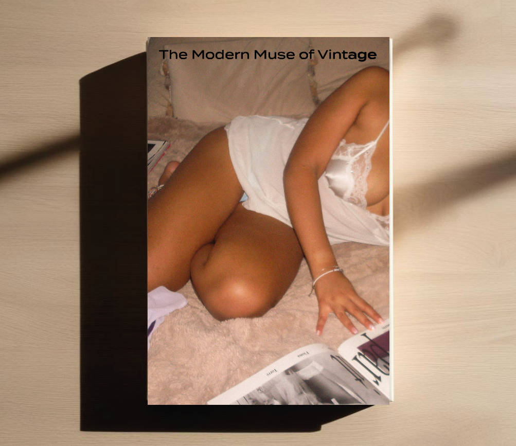
Here is a mockup of the lookbook. I decided to include models’ names to make the audience feel more connected to the campaign and bring back the aspect of the models being the face of the brand, as they currently don’t have models that are tied to campaigns the same way they did before the rebrand.
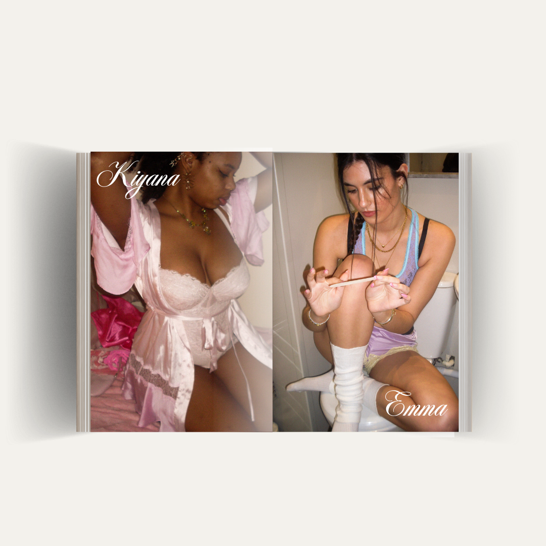
the lookbook
My self-devised project mockup